For my Senior Capstone, I created a whiskey brand and blended my design skills with my glassblowing experience. My goal in taking on a project of this scope was to push myself in the glass studio and to explore how graphic design can marry with traditional art-making.
To tackle such an expansive project, I created a guiding statement to focus my efforts on.
"In the world of alcoholic beverages, there has been a deep divide between 'feminine' and 'masculine' drinks. Why not shake things up to show that anyone can drink anything?"
Through my process and final designs, I found an answer to that statement.
"Wench is a gritty distilling company that challenges the traditional narrative and makes room for everyone in a male-dominant drinking market through humor and aesthetics."
Research & Experimentation
A project like this doesn't come out of thin air. I started by exploring market research through the Mintel Database and performing competitive analyses of brands that had similar brand stories to my concept. From that, I gathered inspiration and context that would guide the direction of my work. Patterns and opportunities were also identified in this process that would push my project beyond what's expected.
This phase wasn't just about gathering information, it was about building a strong foundation to inform every creative decision moving forward. The insights I uncovered directly influenced my design experimentation moving forward.
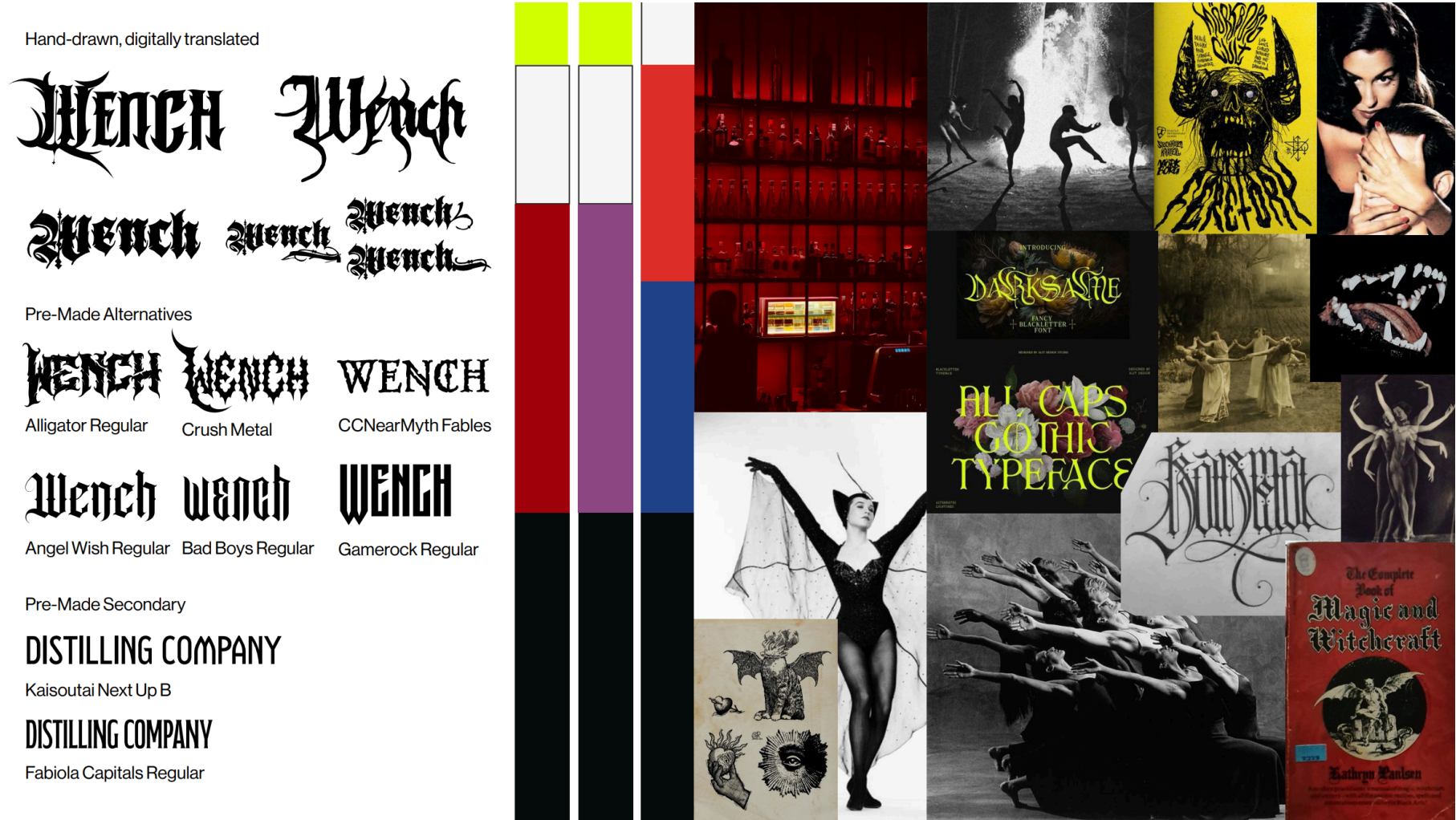
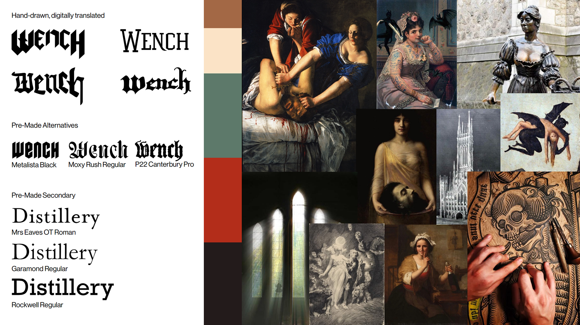
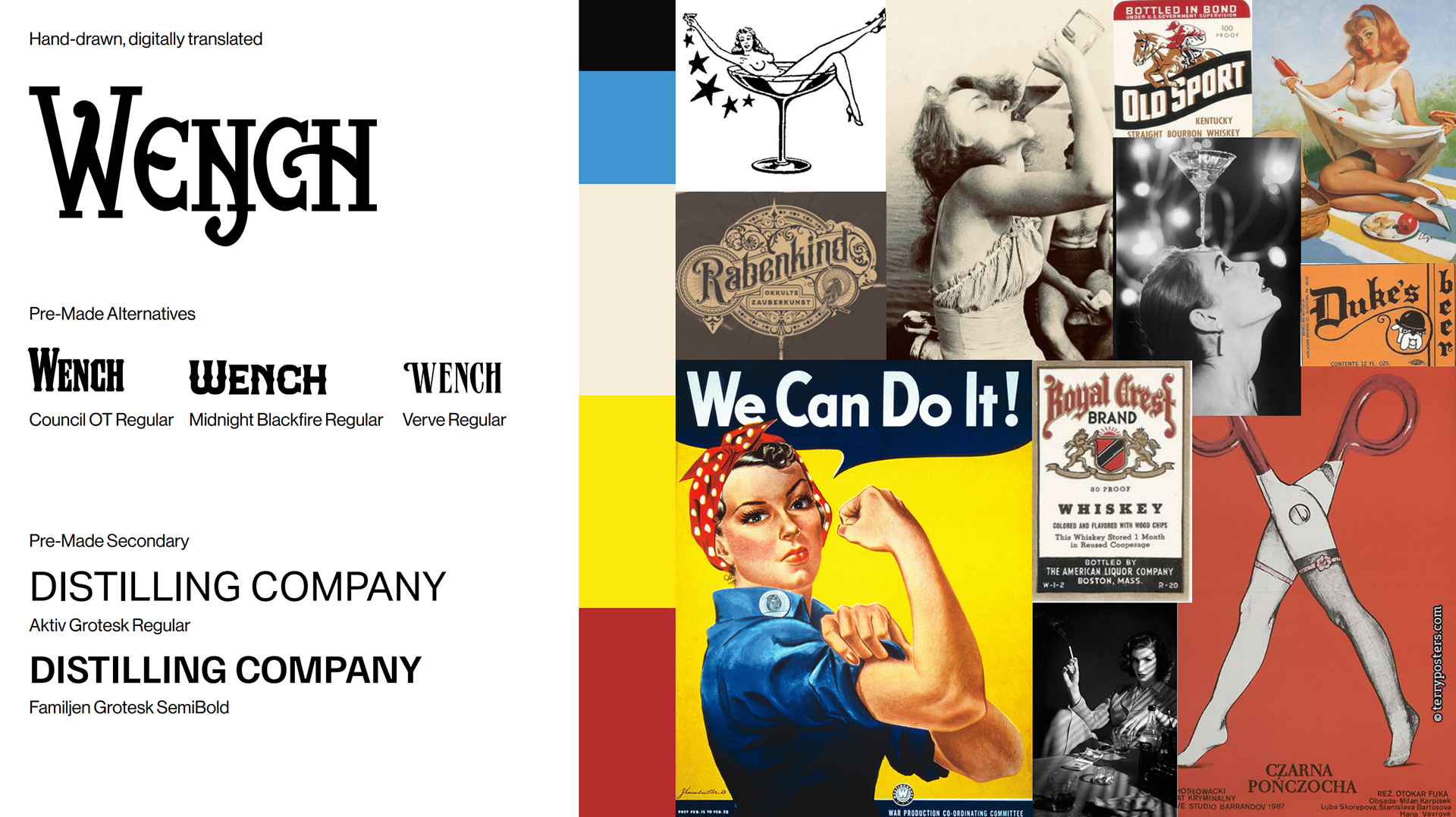
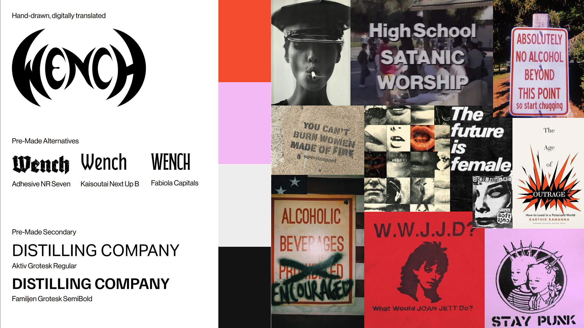
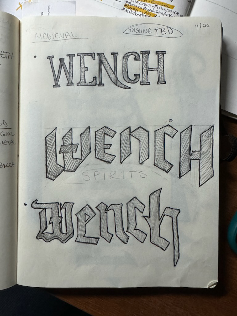
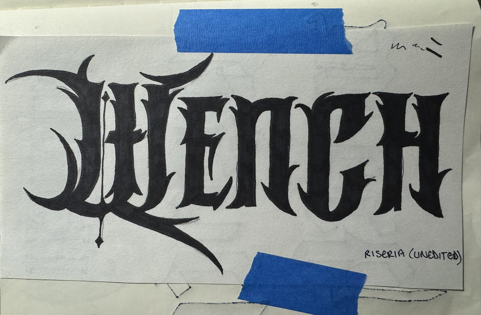
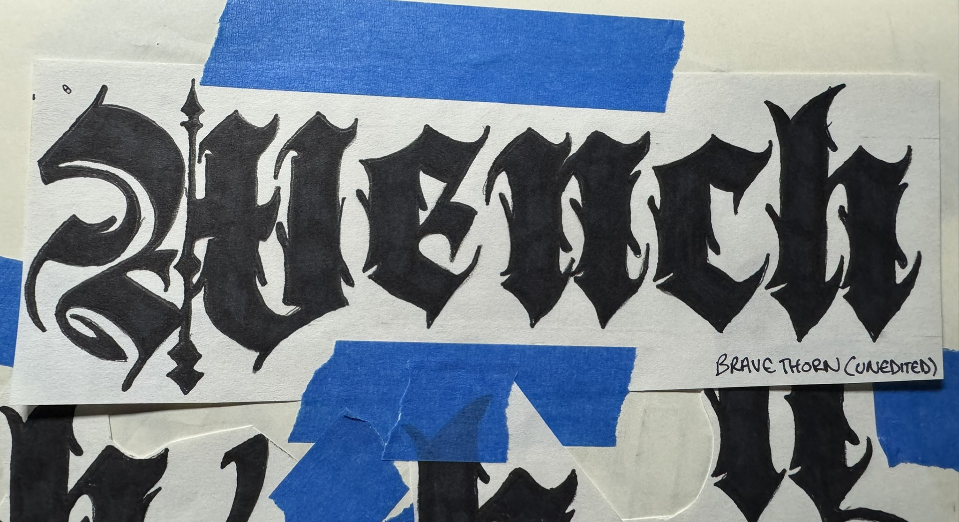
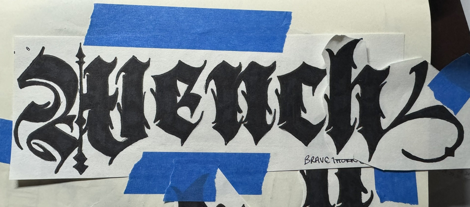
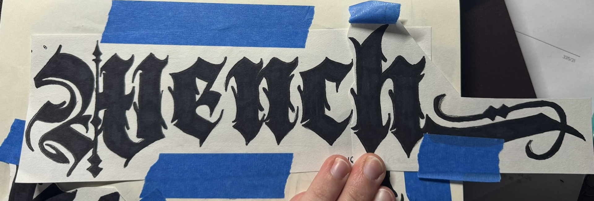
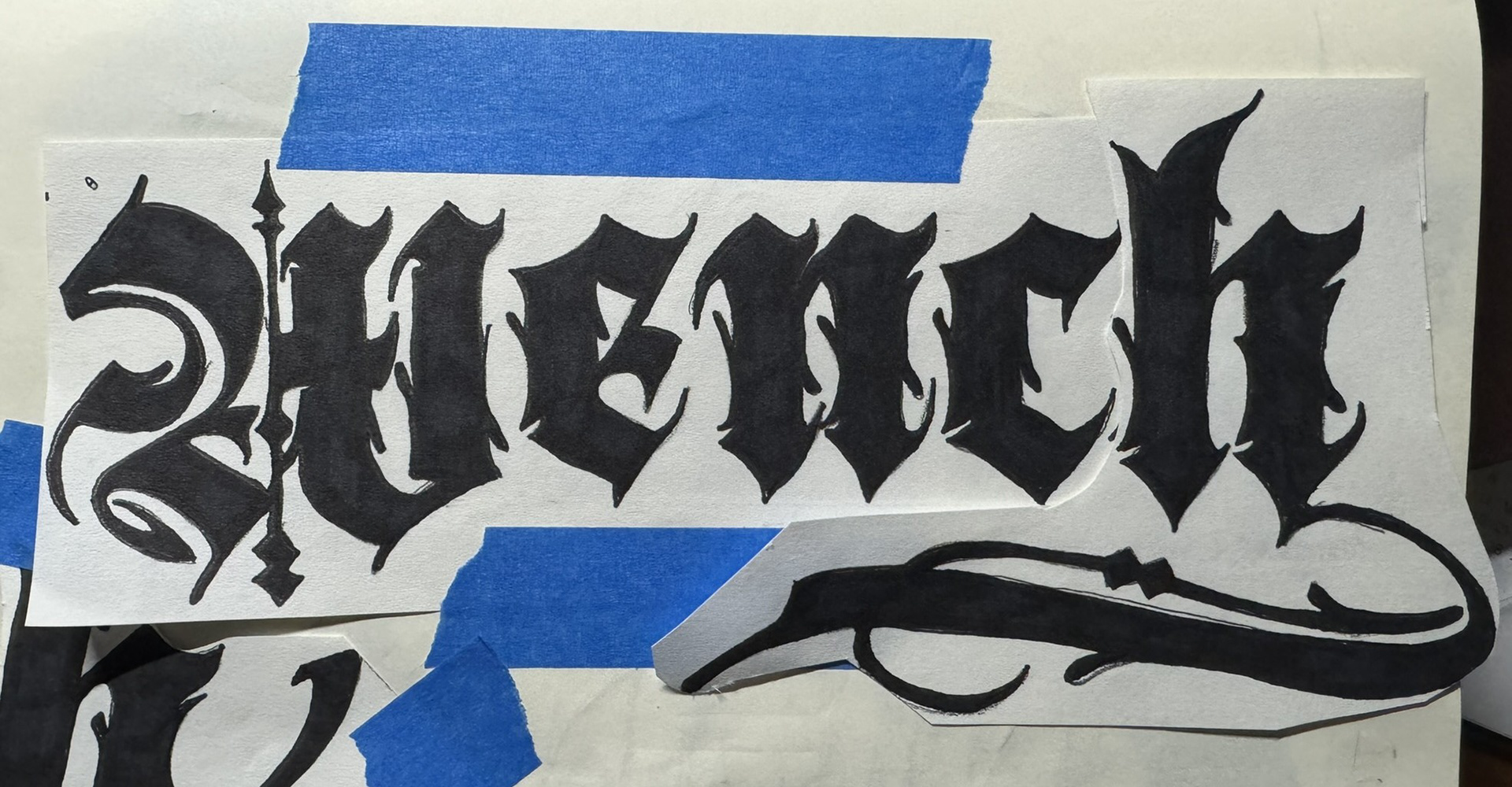
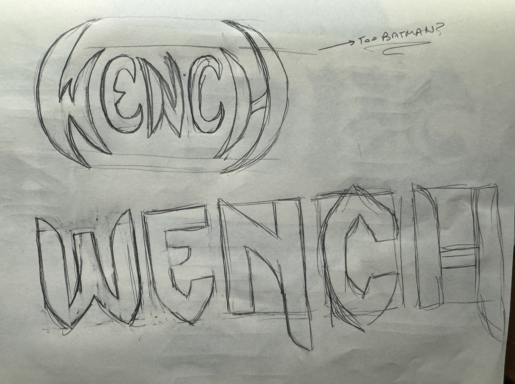
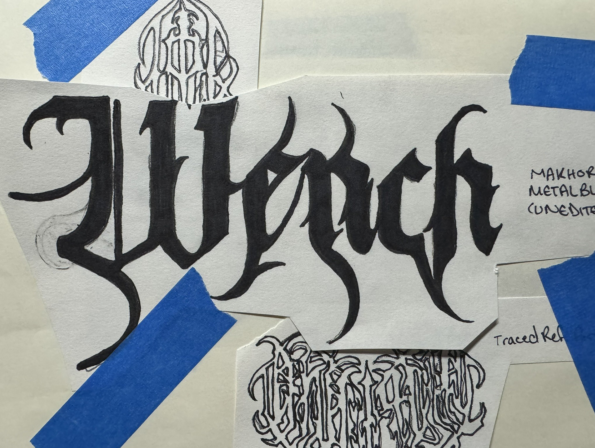
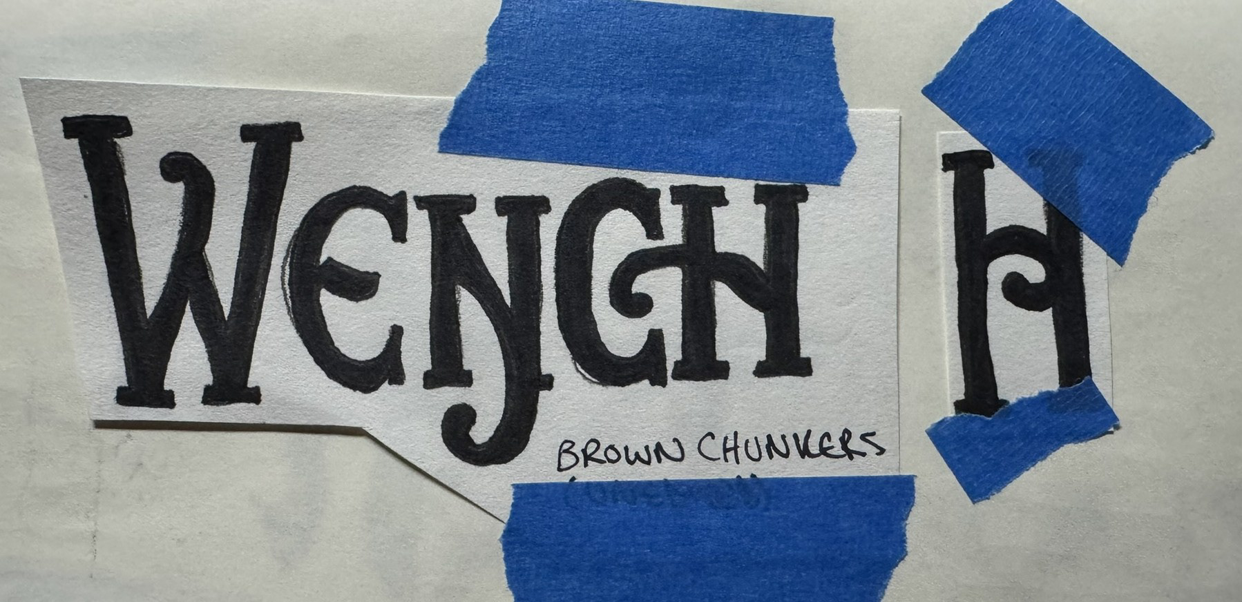
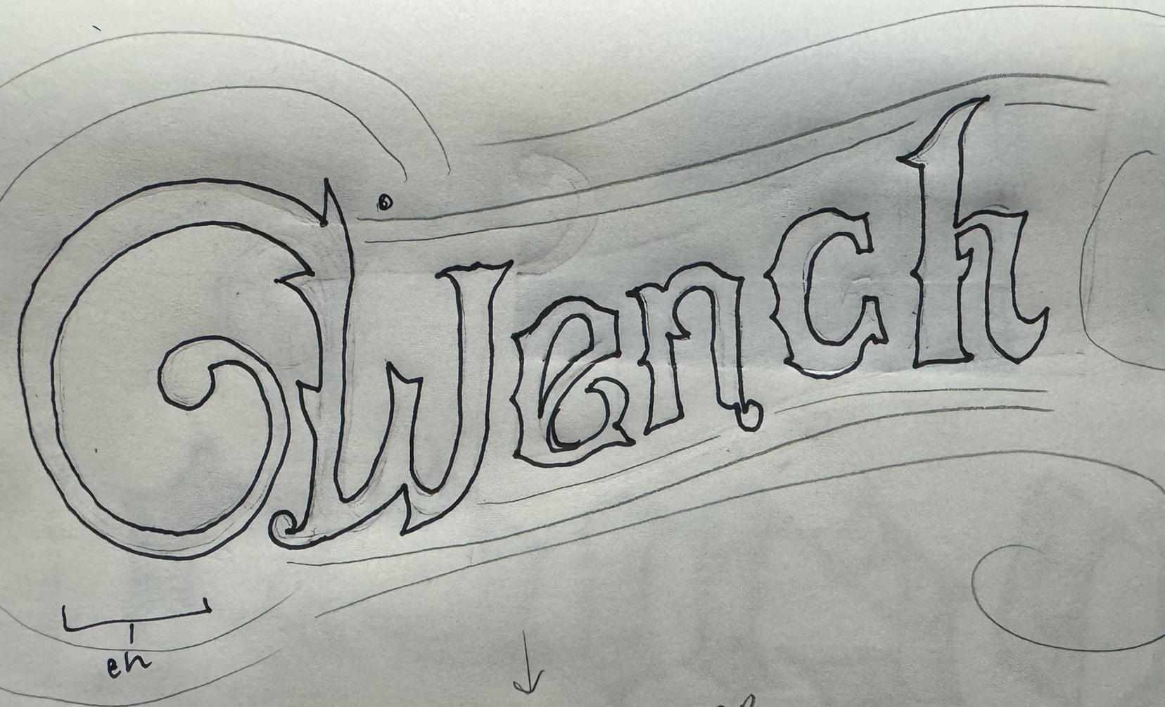
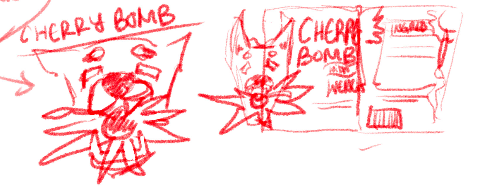
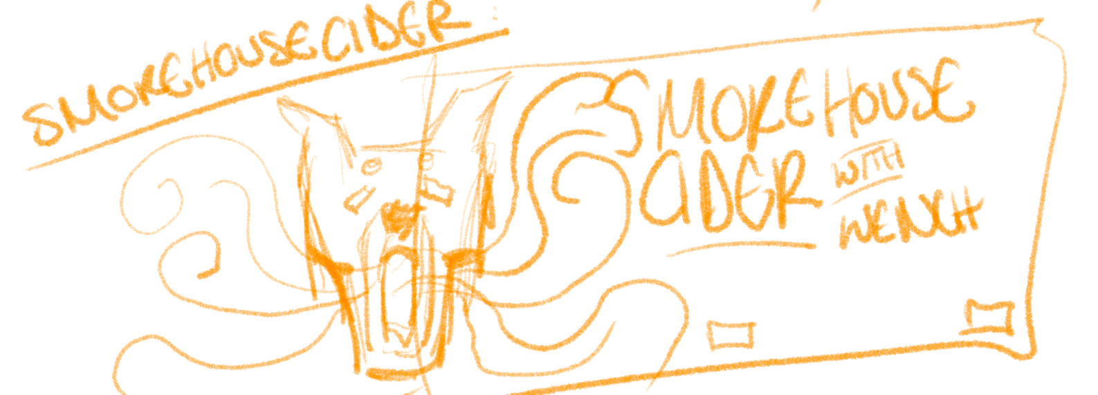
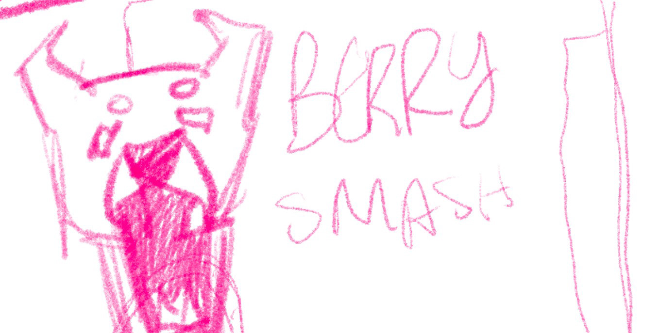
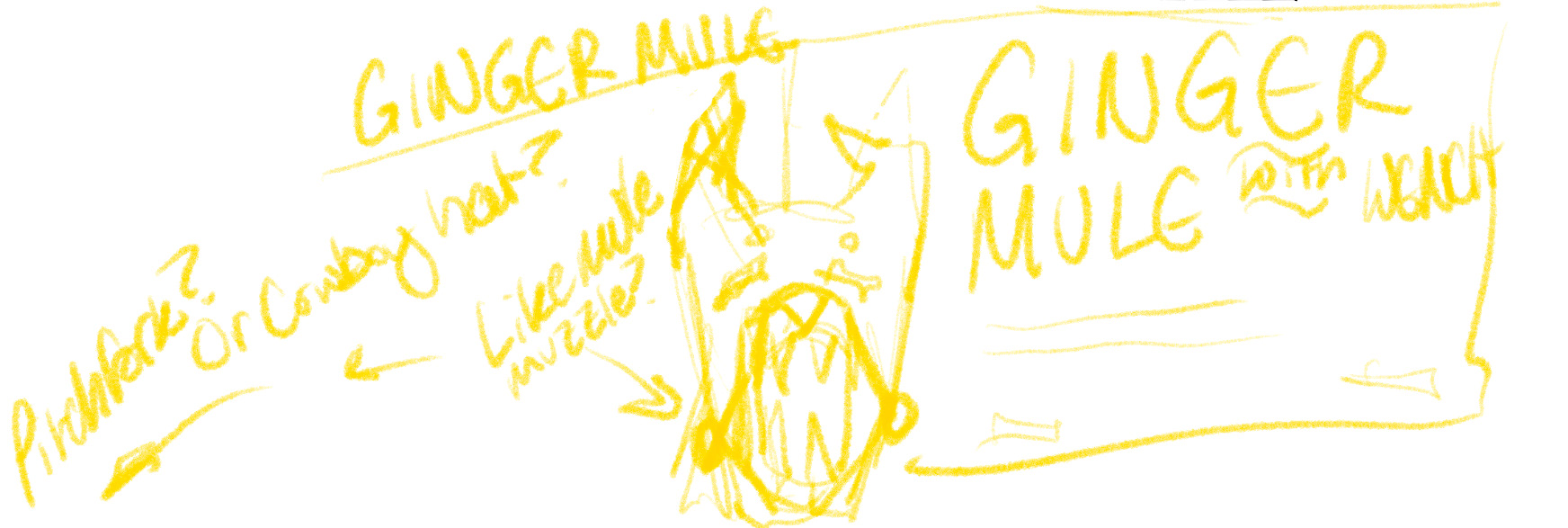
Above are some early moodboards of branding directions for Wench; below is my typographic experimentation.
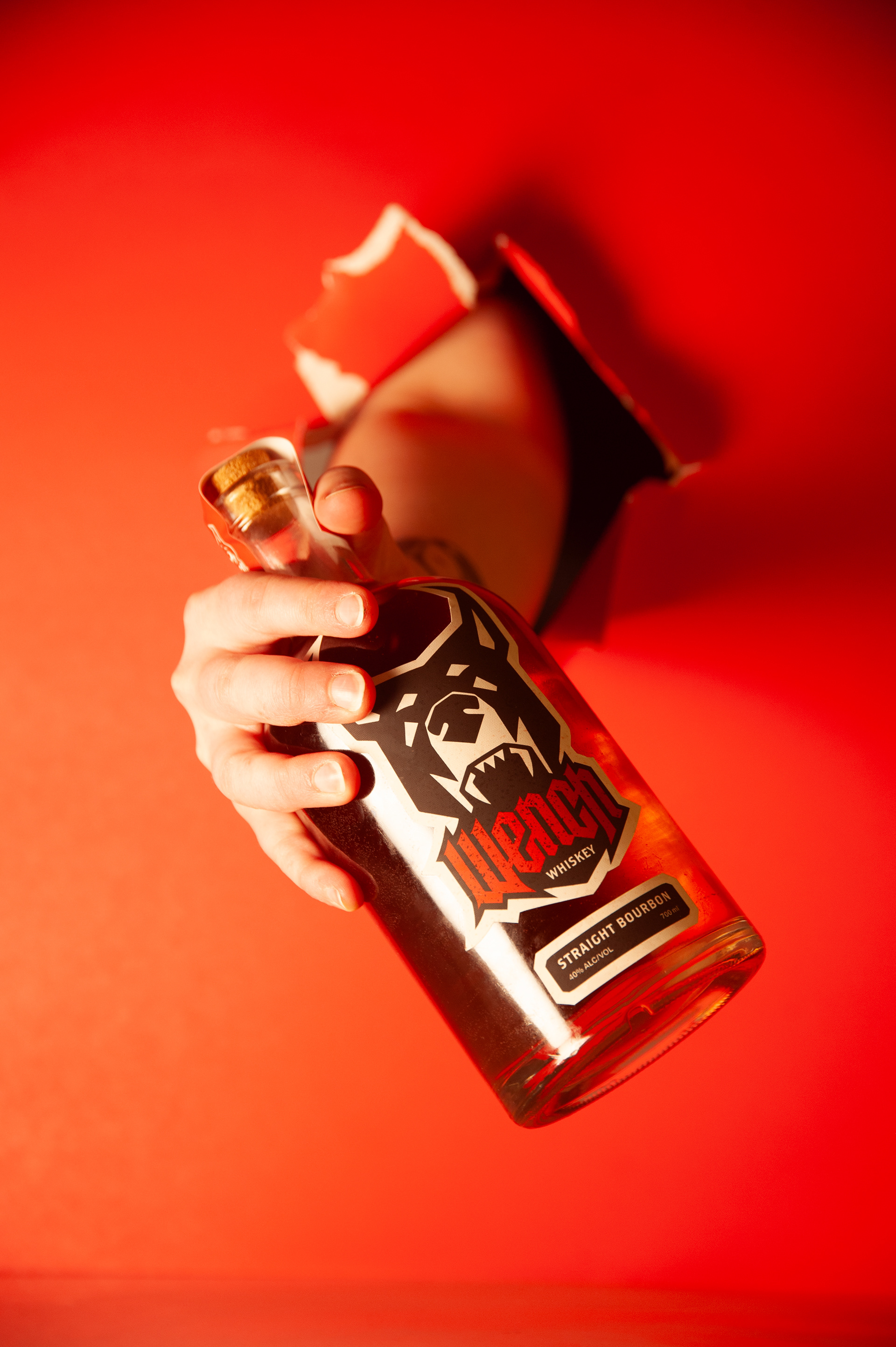
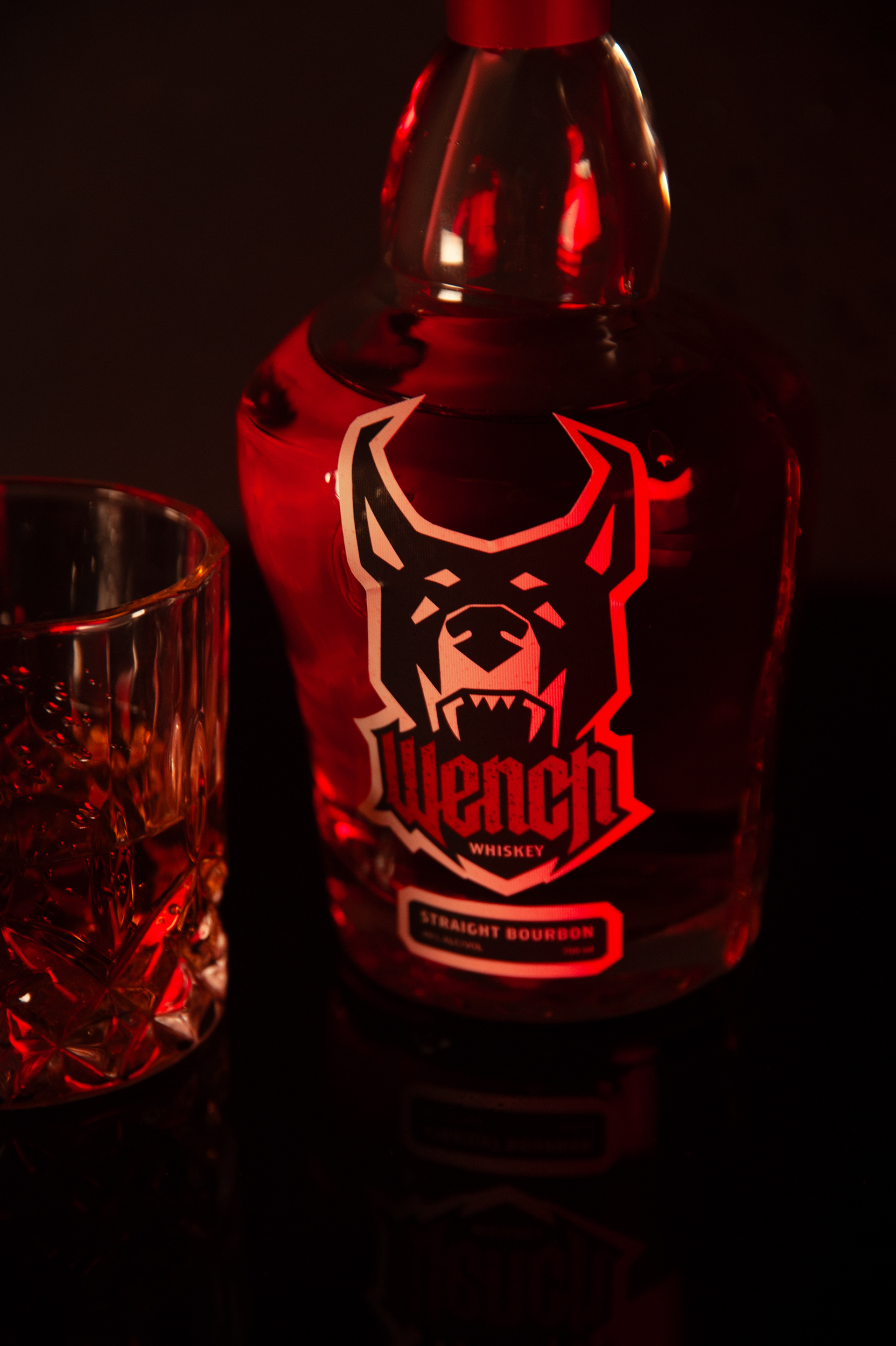
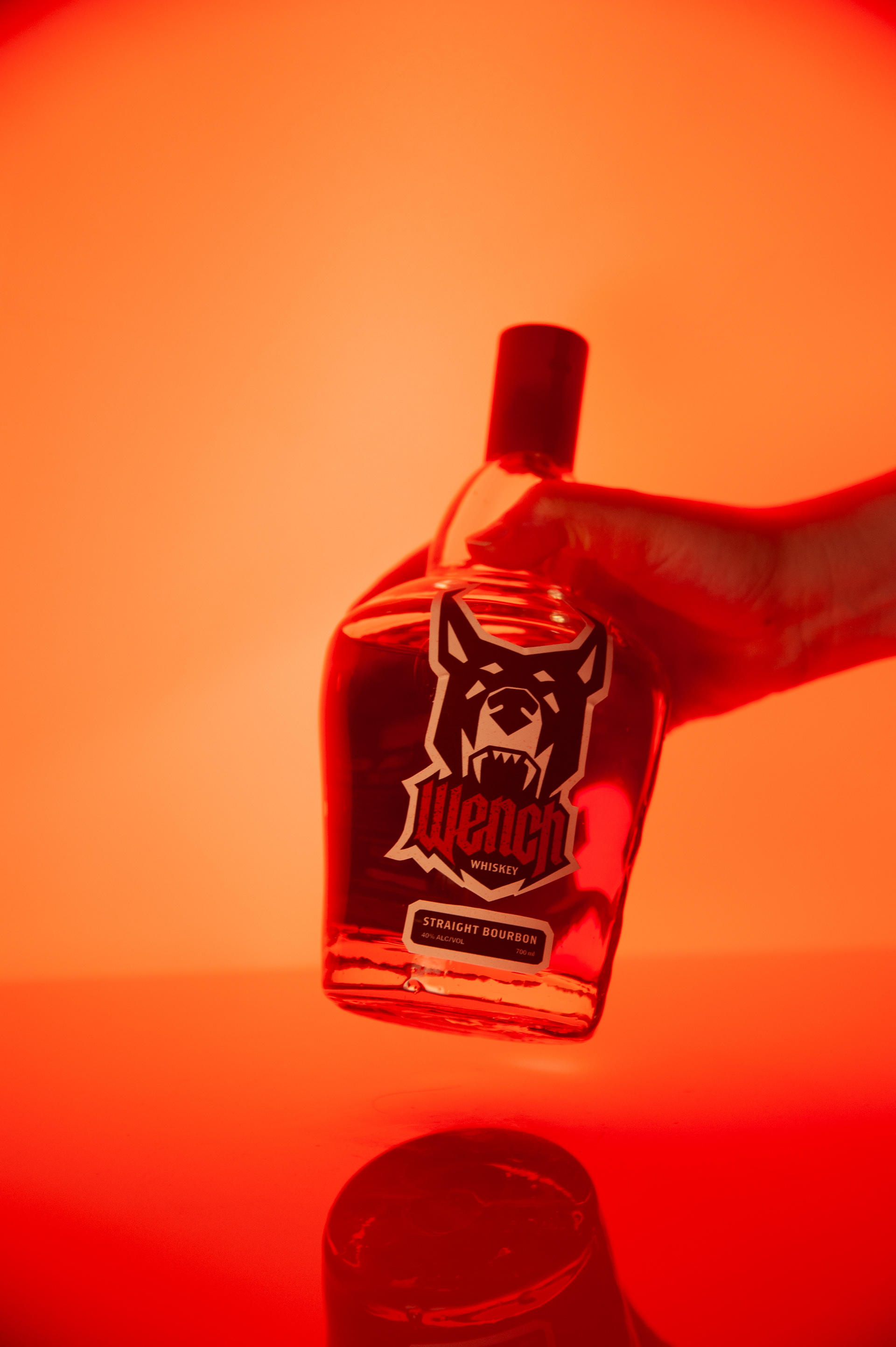
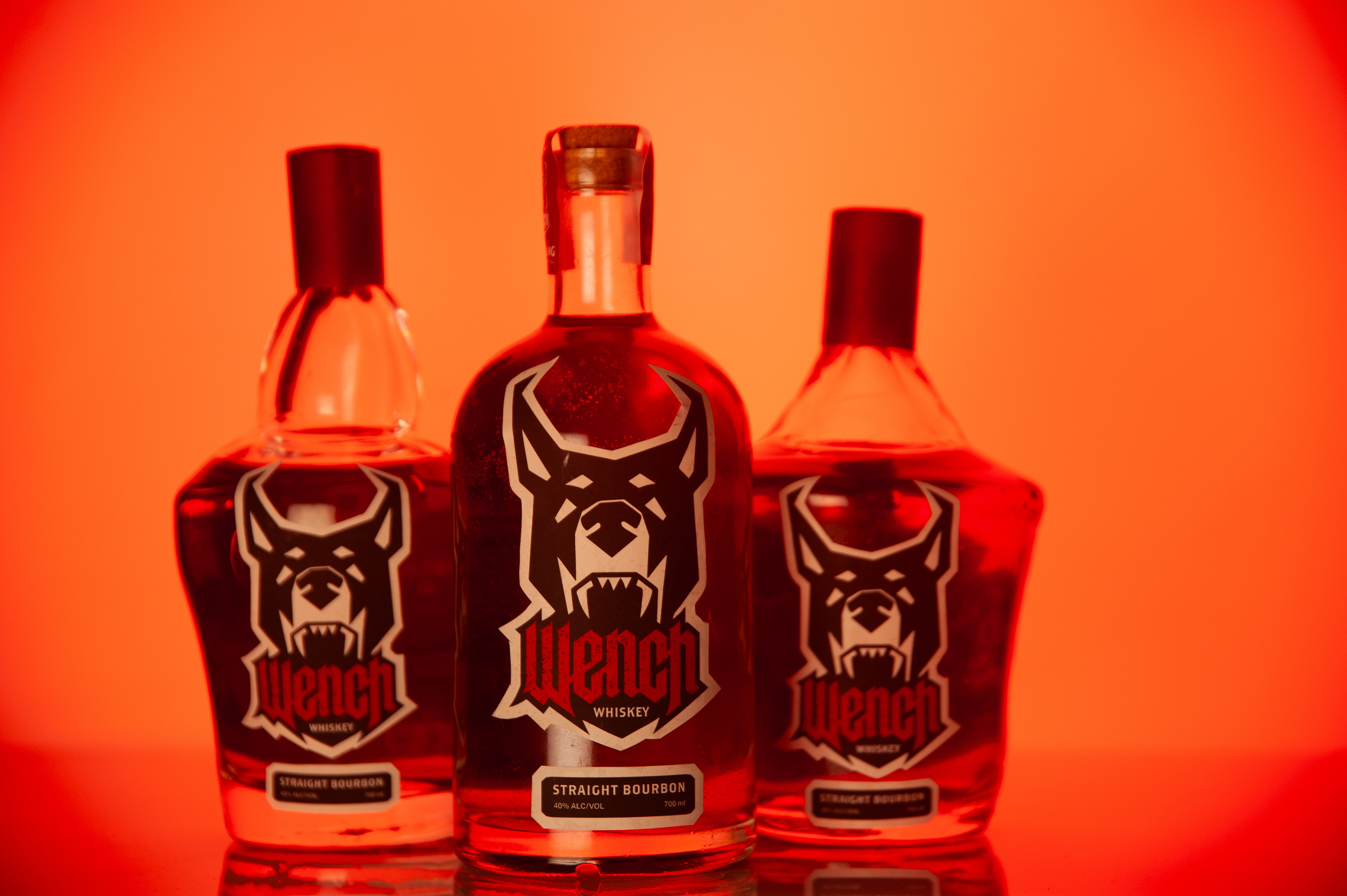
My Glass Process
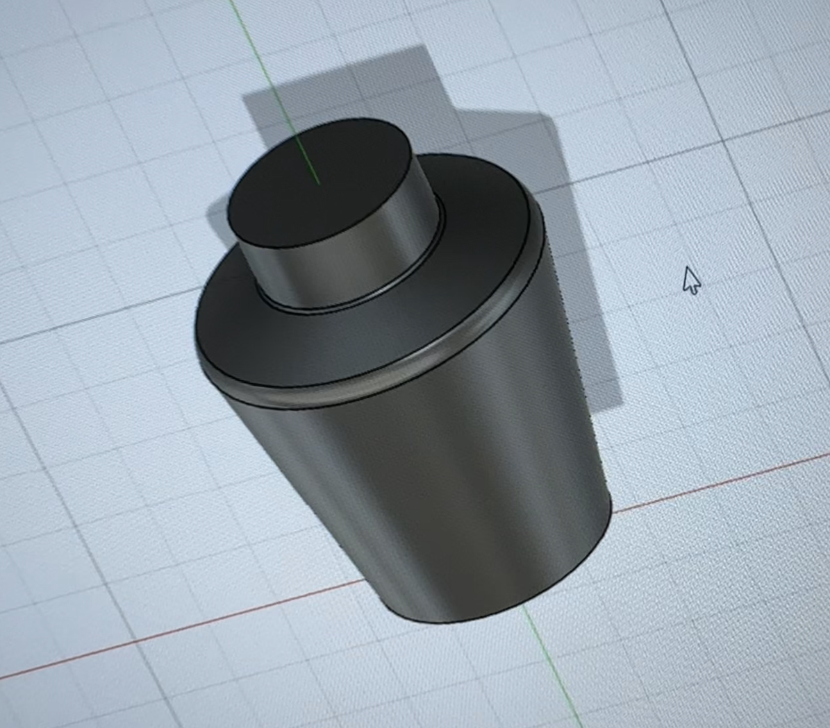
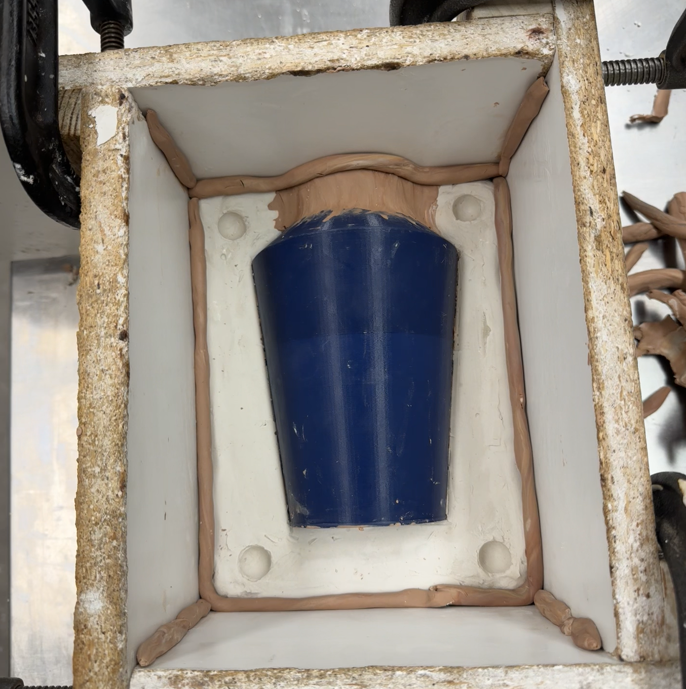
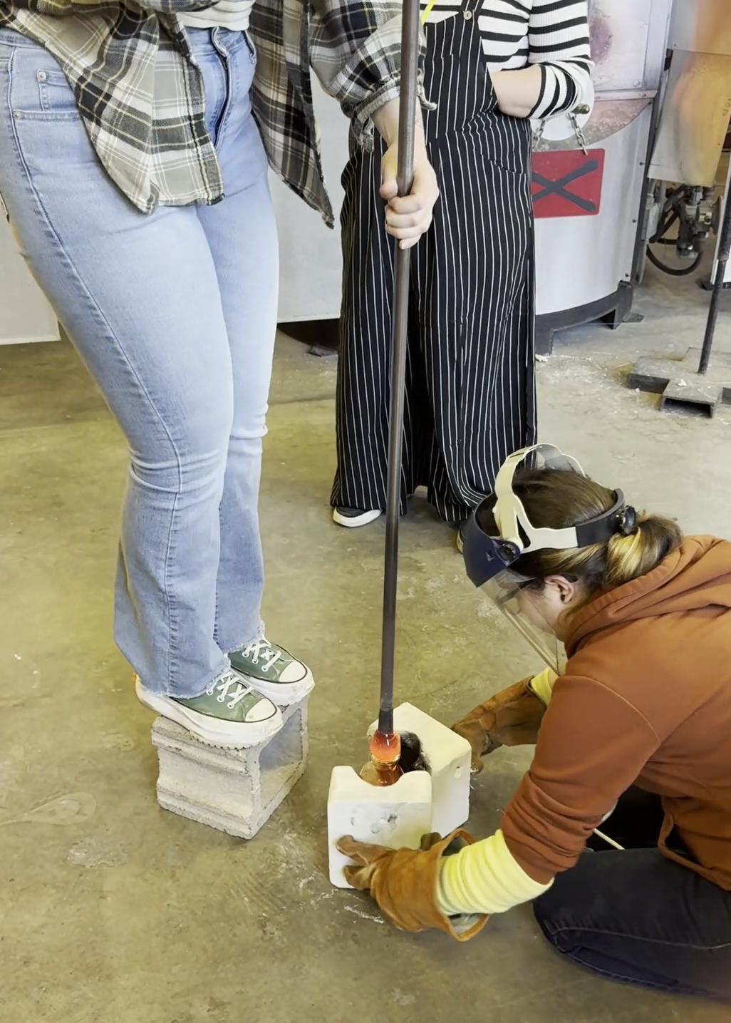
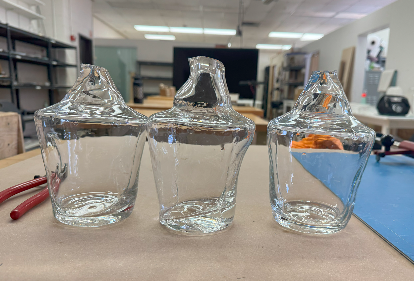
Designing and blowing the glass bottles for Wench was one of the most hands-on and rewarding parts of the packaging design process. I started by sketching out concepts that would capture the spirit of the brand, experimenting with form, texture, and finishes that felt both functional and expressive.
Once I solidified my direction, I moved into the studio where the real work began. I created plaster molds and used those to practice my technique. Then, I modeled, printed, and cast the final form. The creative process itself was a blend of precision and improvisation, each session bringing new challenges, from proper bubble setup to pulling bottle necks properly.
Throughout, I focused on refining the skills I had already acquired and expanding upon them, aiming to create bottles that felt authentic to Wench's story. Each finished piece became a physical record of experimentation and discovery, and seeing the final collection come together was a reminder of just how much can happen when you're willing to get your hands dirty and trust the process.
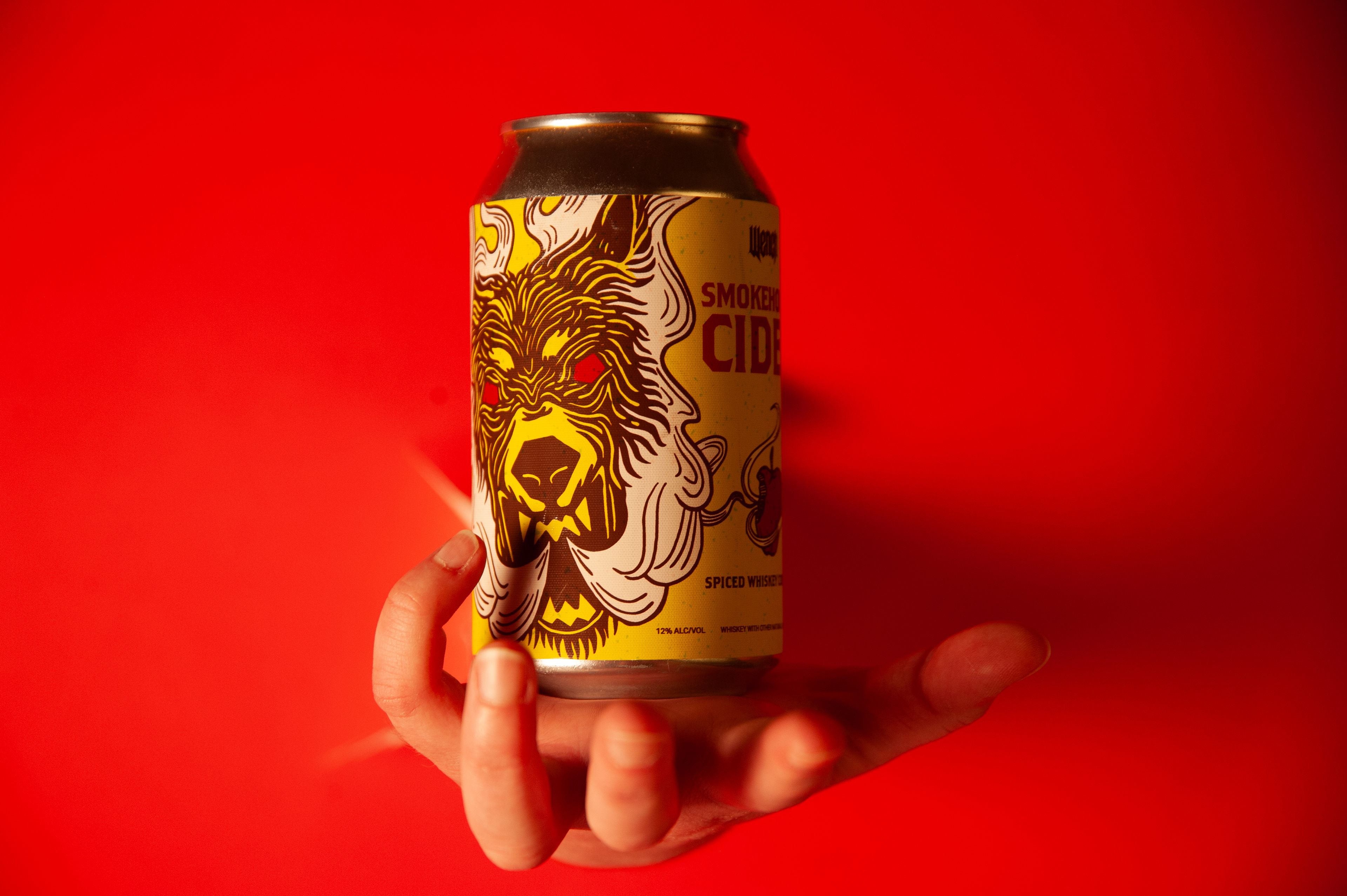
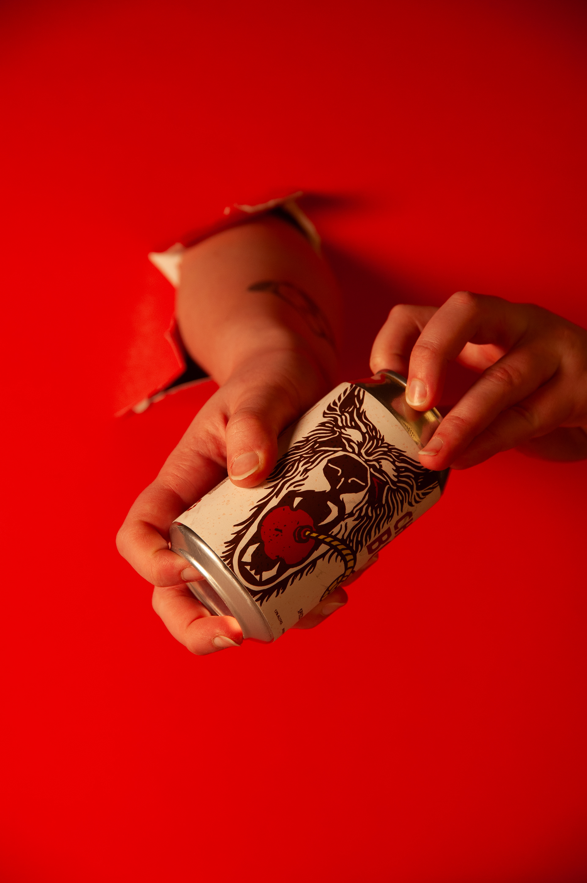
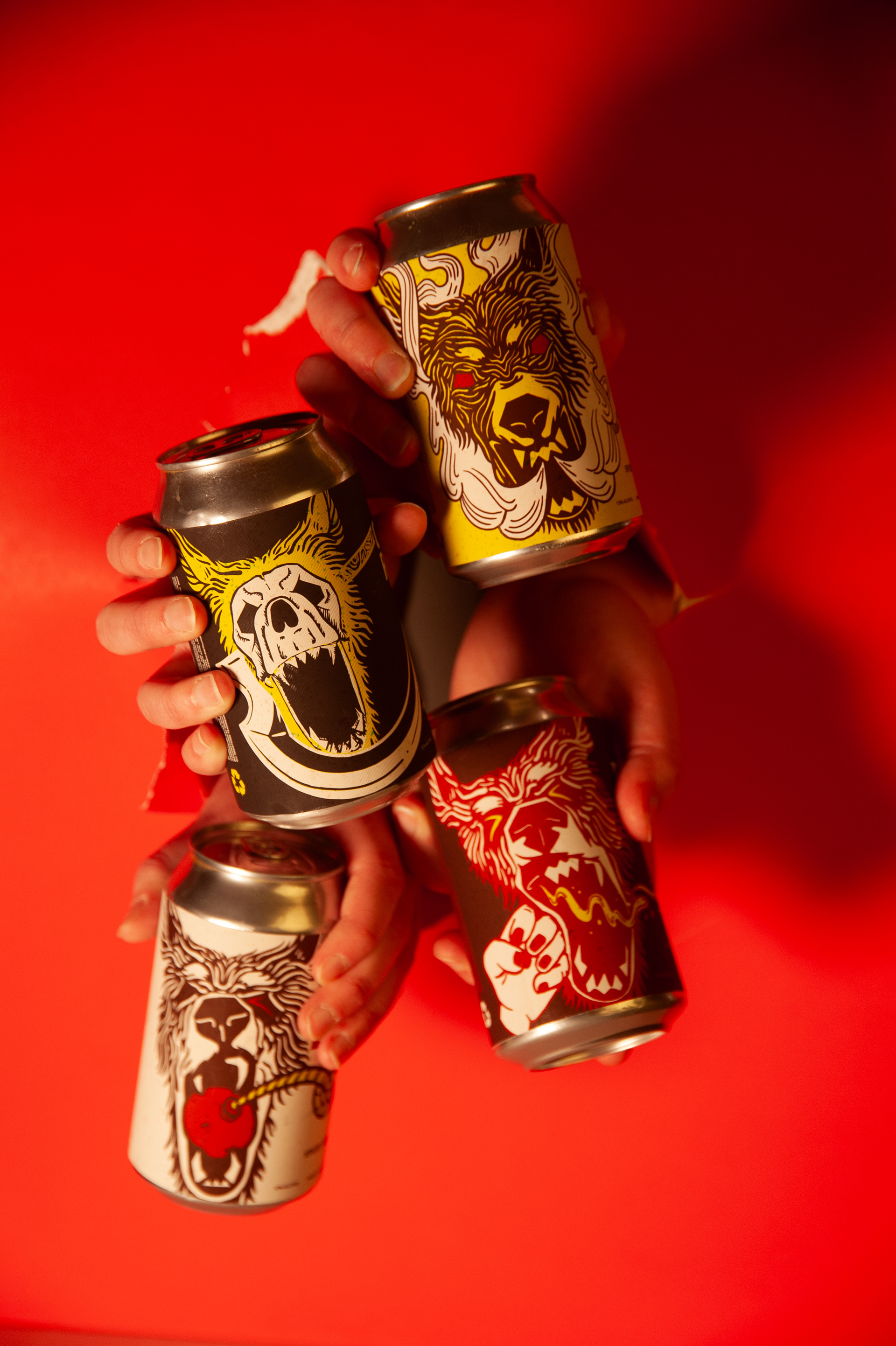
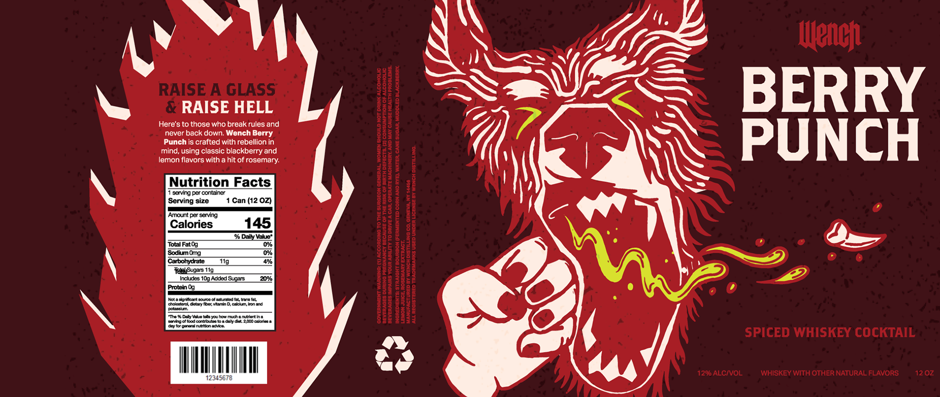
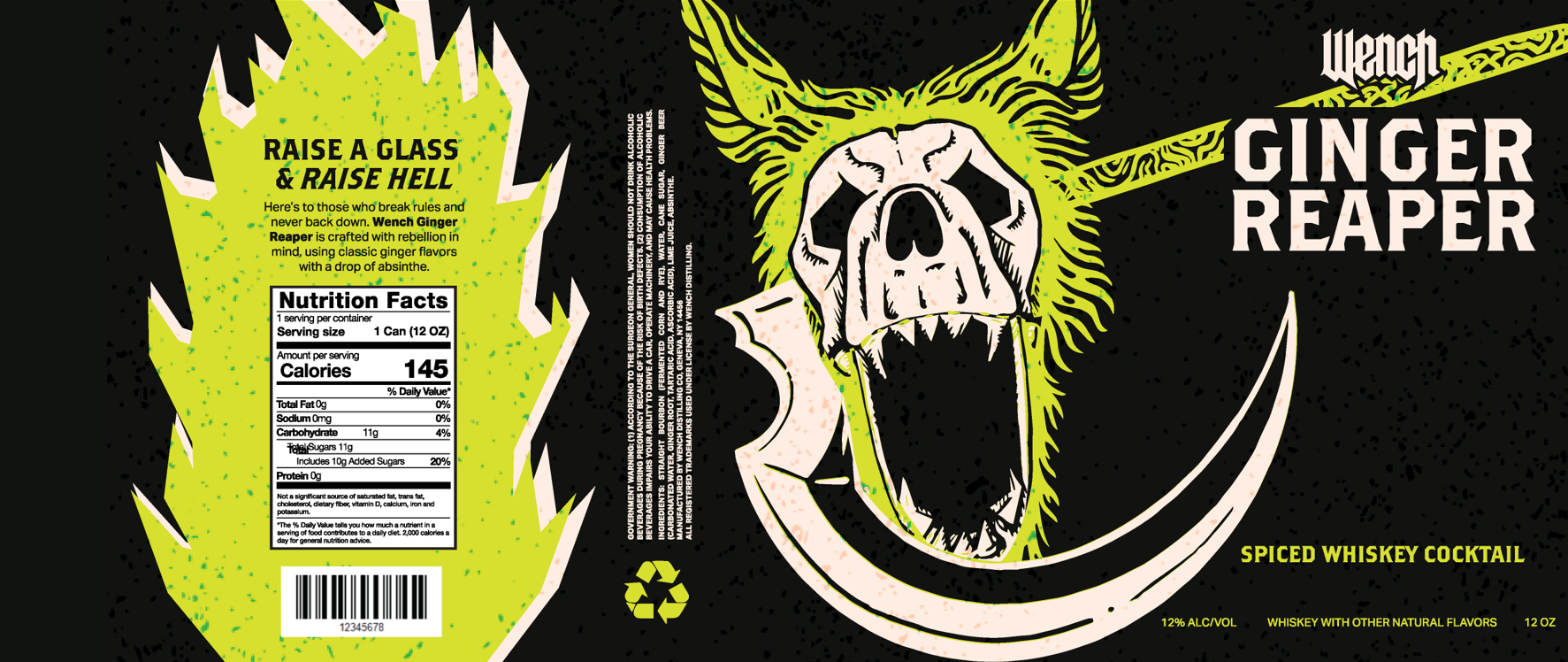
Illustration
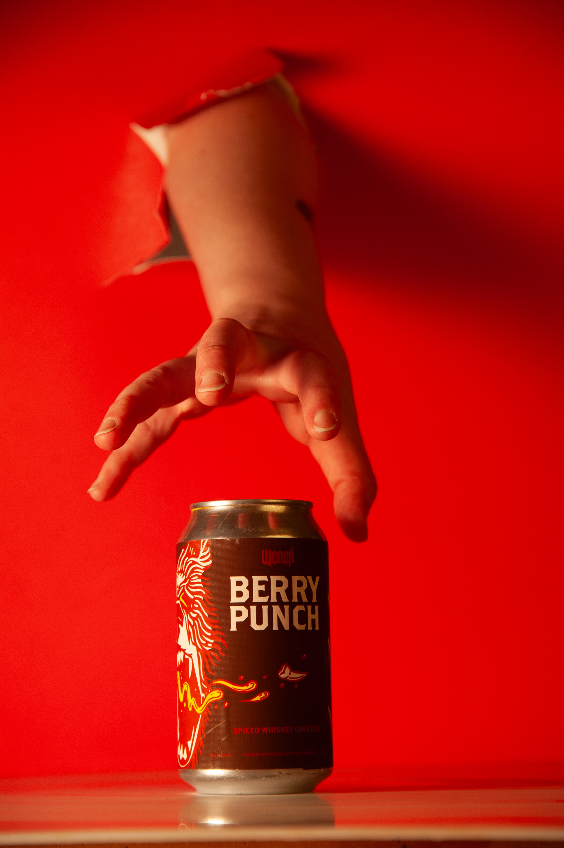
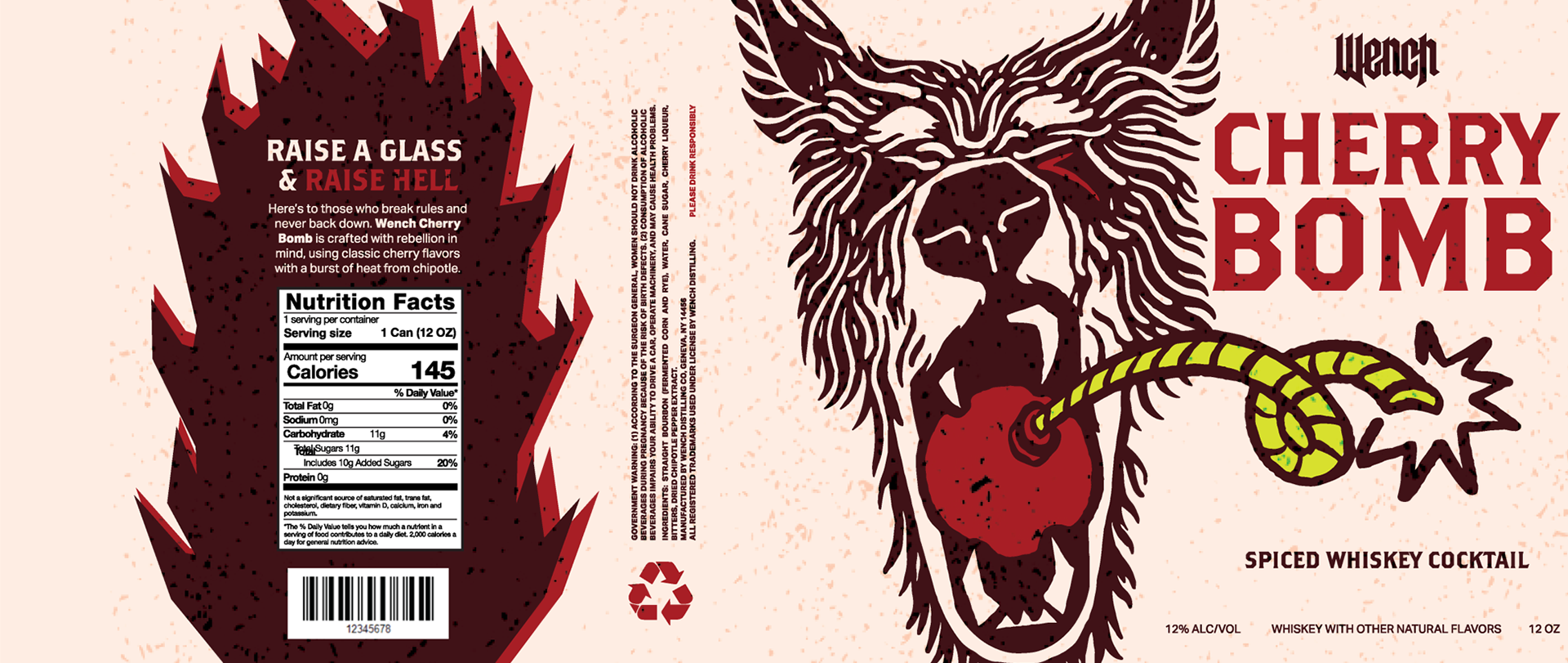
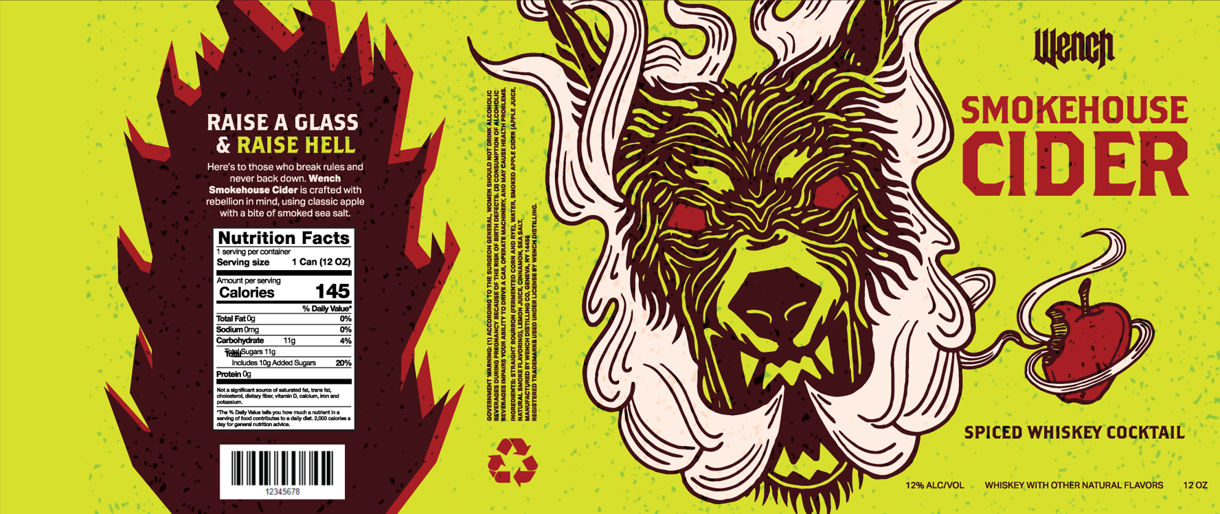
Branding a classic whiskey was a great start, but I wanted to take things further-so I created Wench canned cocktails. For these labels, I leaned into a more illustrative style to give each flavor its own distinct personality and make the cans stand out on the shelf. Every illustration was inspired by the original Wench whiskey logo, tying the new cocktails back to the brand’s roots while letting each can tell its own story.
Below, you'll see my illustration process from ideation to packaging application.
Wench Distilling
Here is the final brand, Wench Whiskey and Distilling! I'd like to thank Professor William Colgrove for his guidance as my capstone professor, Lecturer Suzanne Peck for her guidance in the glass studio, Lyle Lewis for his excellent photography skills, and the College of Art and Design for allowing me to intersect my two passions into one crazy project.